
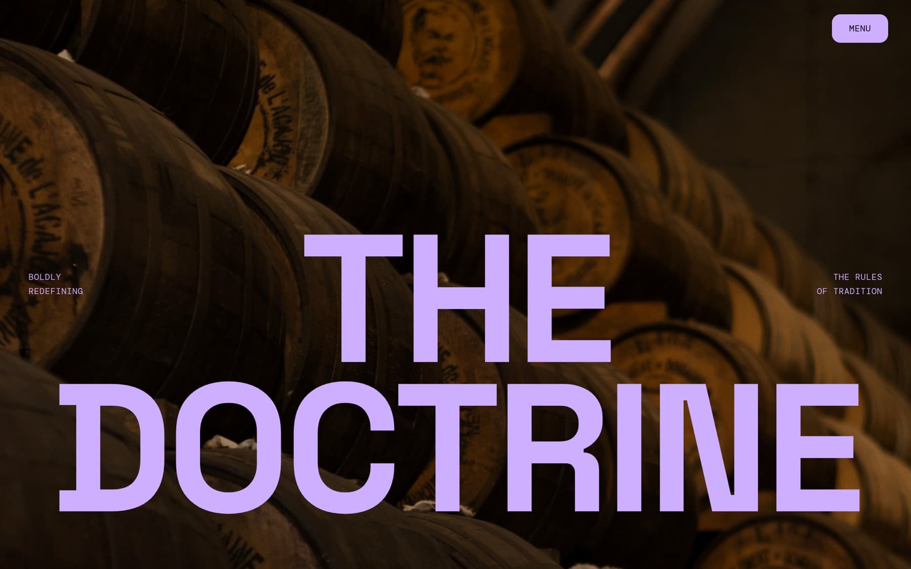
The homepage, a giant lilac display lockup over a graded cask hall, corner labels anchoring the doctrine.
A rebel whisky needed a site with attitude: cinematic motion, a striking palette and type, and a scroll that pulls you through the story. Bold, smoky, personal, never dull.

Built in Next.js with GSAP: a preloader ritual, scroll-scrubbed parallax, image clip-reveals (a lilac panel wiping up off each frame), an arched curved gallery and a staggered full-screen menu. One luminous accent doing all the work.
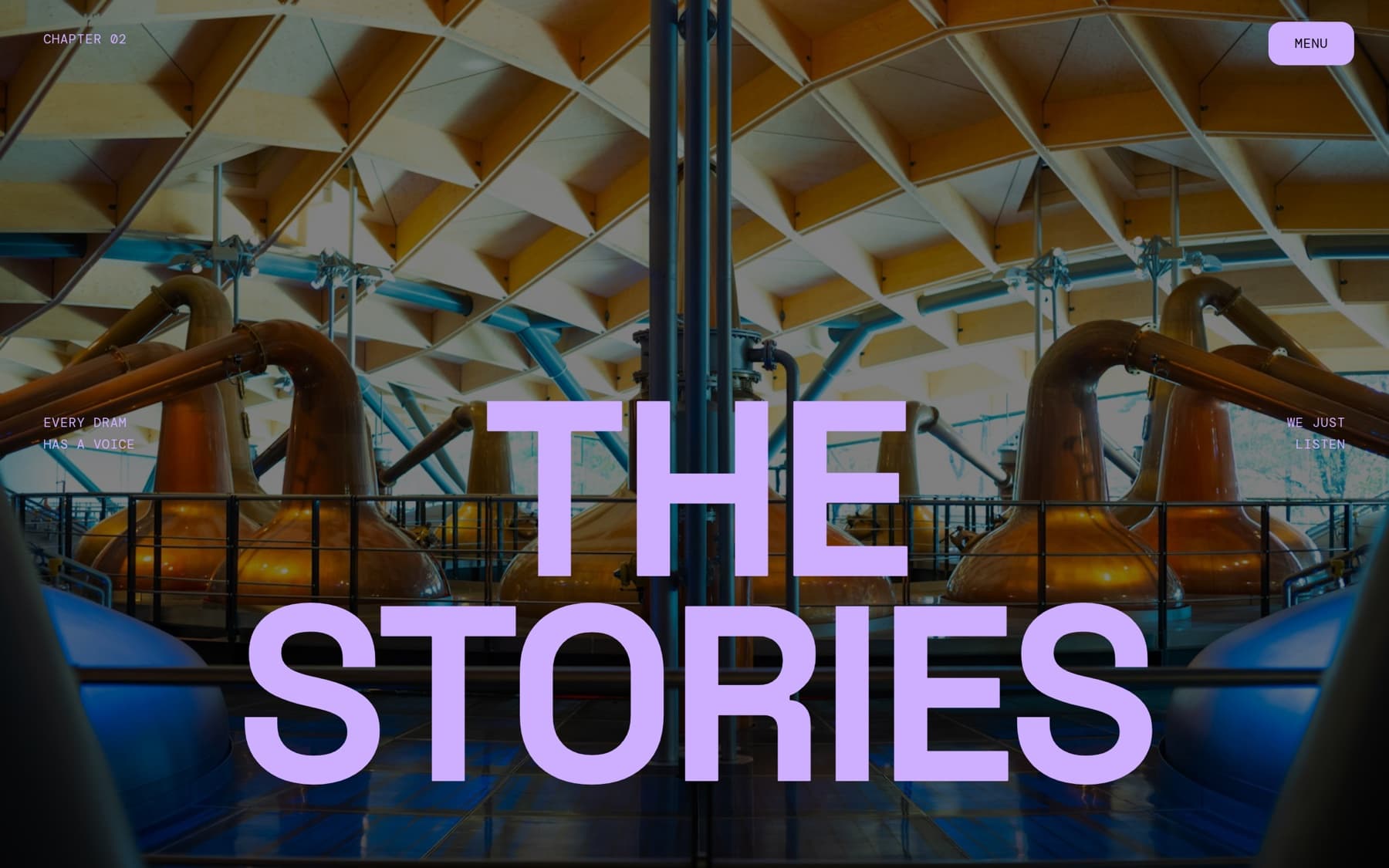
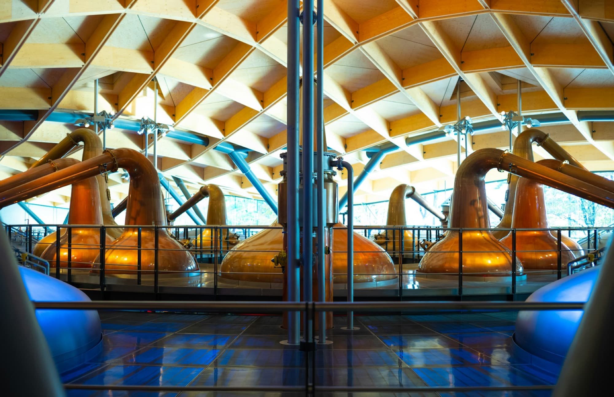
The Stories, chapter pages carry the same display + corner-label system, image-led throughout.
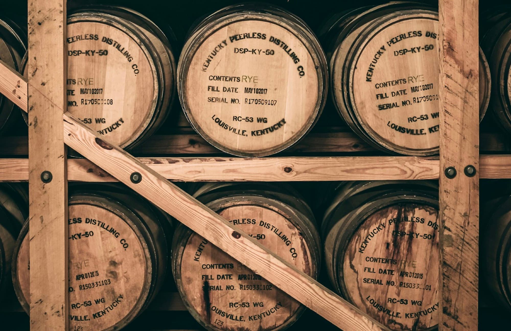
Production told through casks and patience: “every cask strikes a perfect balance between power and finesse, peat and vision, matter and soul.” Hand-selected for character, not convention.
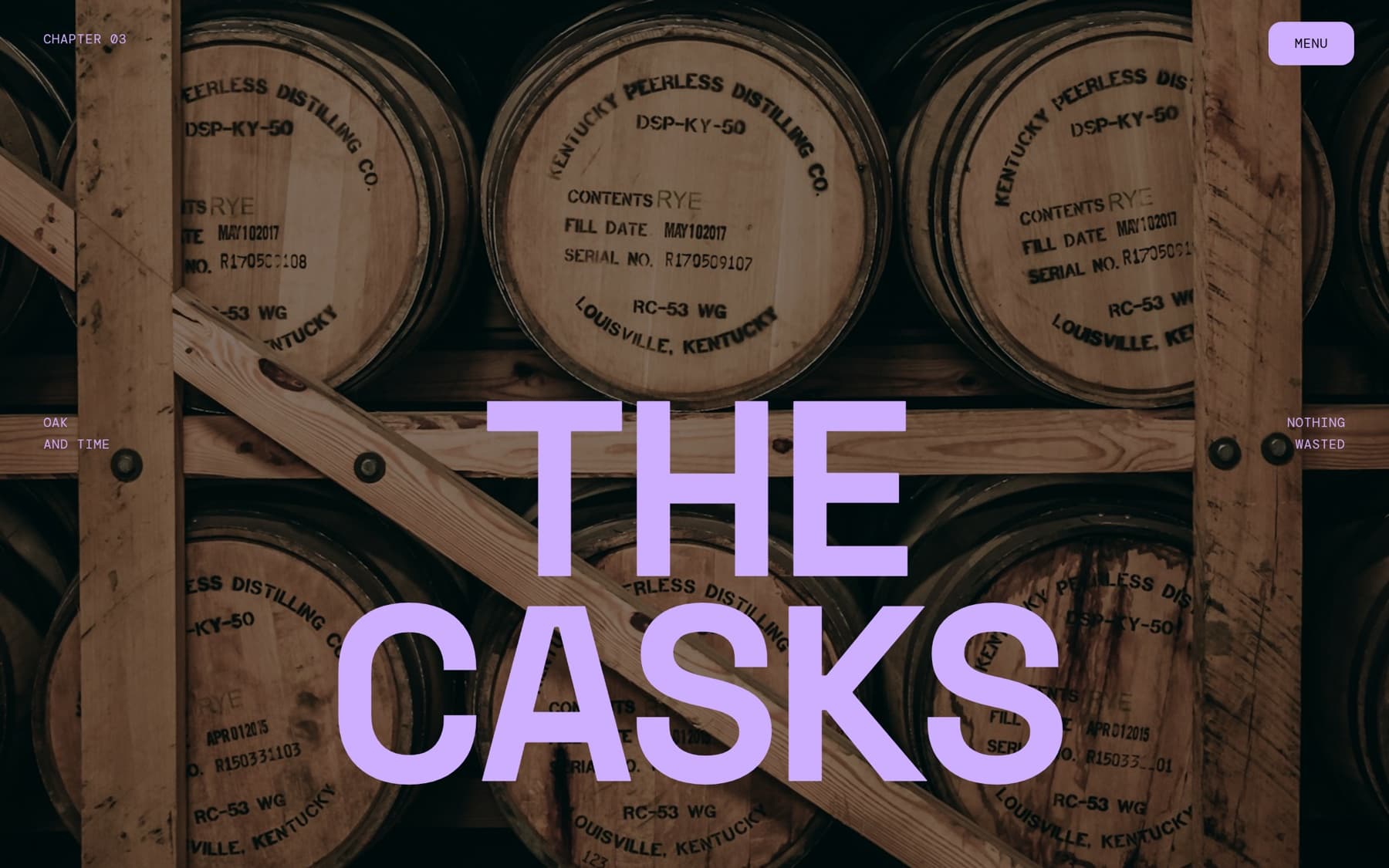
Space Grotesk (heavy display) over Inter, DM Mono labels: loud, modern, uncompromising.
Sophisticated yet irreverent: bold, smoky, personal. “Whisky isn’t just a product, it is an idea.” Joy, irony and a pinch of healthy madness.
- Scope
- Front-end design · build
- Stack
- Next.js · Tailwind · GSAP
- Type
- Space Grotesk · DM Mono · Inter
- Status
- Live