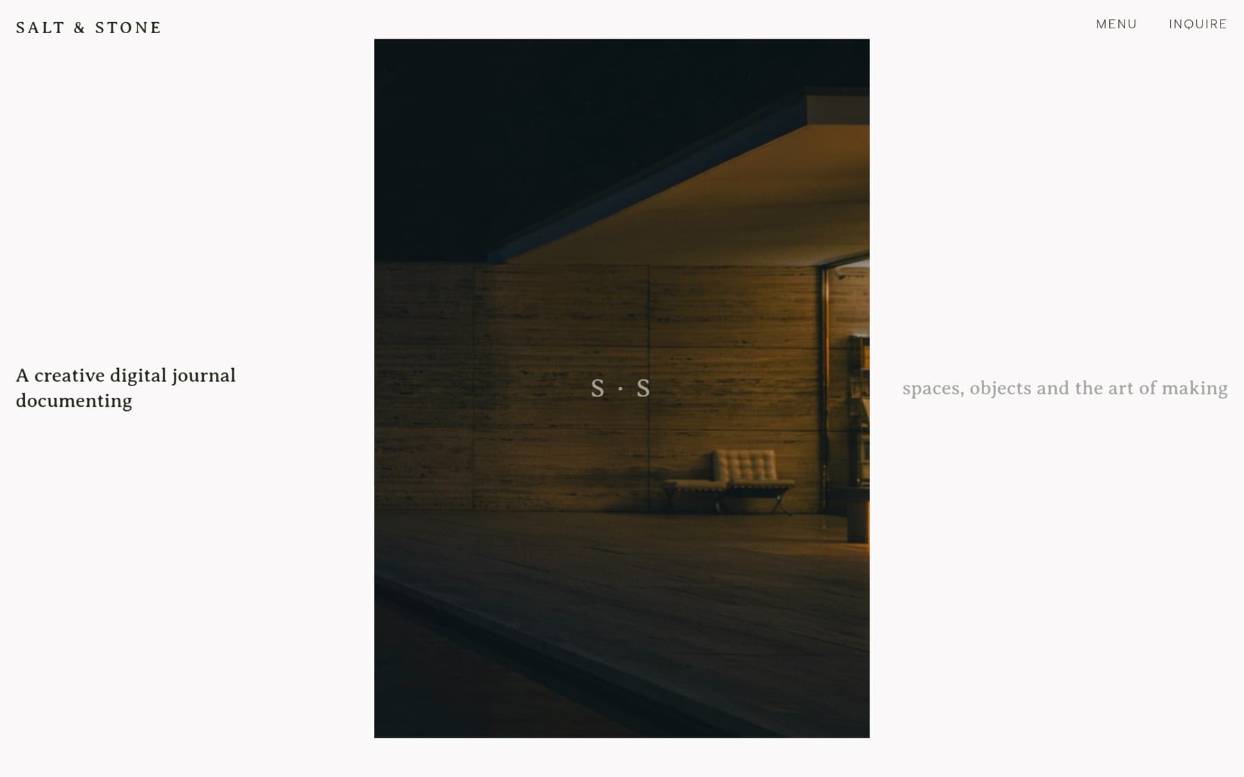
The homepage, a faithful three-column hero, type beside a single quiet portrait.
A considered editorial brand needed a site to match: type-first, slow, with whitespace and structure doing the work. Less reportage than record: each piece made to sit with, not scroll past.
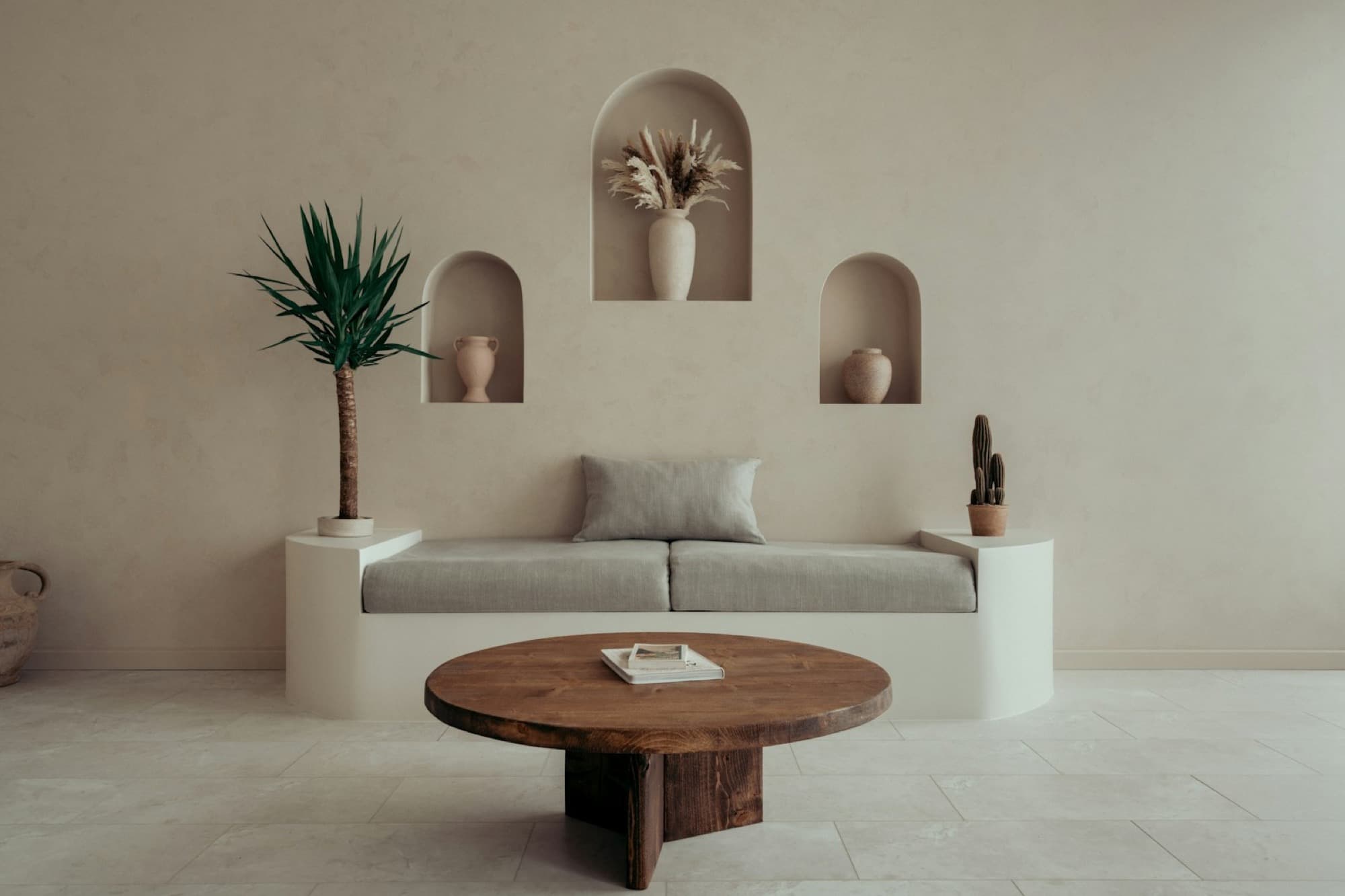
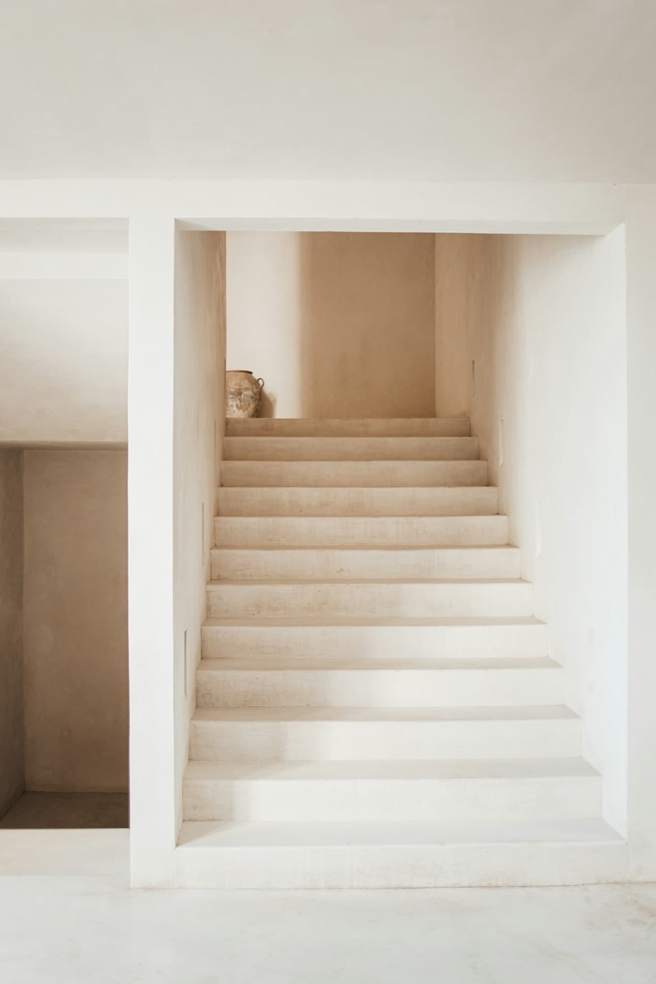
Built in Next.js with GSAP: homepage, journal index and a long-form article template. A three-serif system, offset reading columns, staggered margins and varied aspect ratios, on a strict paper / olive / sage palette. Original copy written for every article.
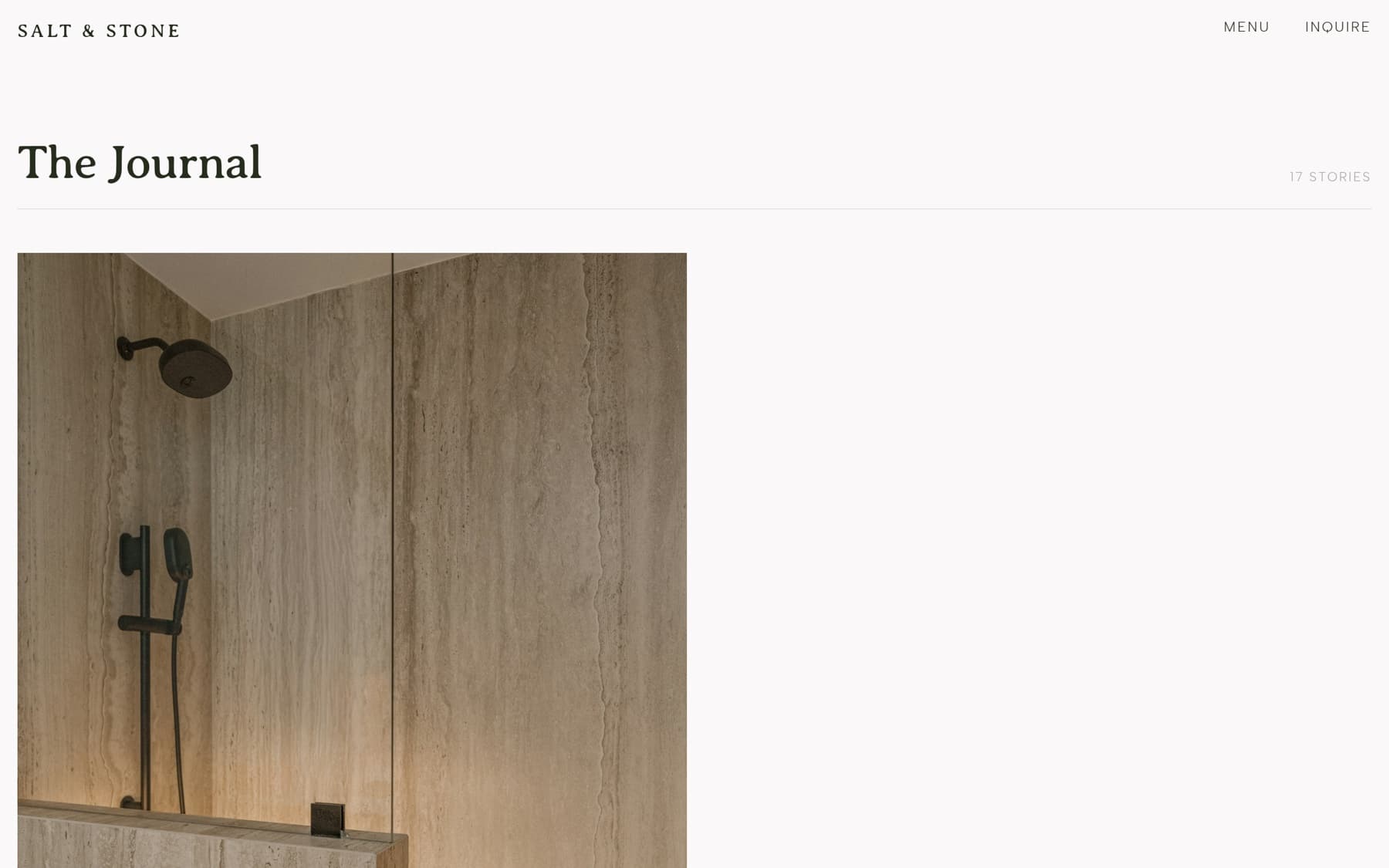
The journal, a 12-column masonry index with staggered, asymmetric placement.
A quieter object thread runs through the journal: single pieces given room and light, photographed to be considered rather than consumed.
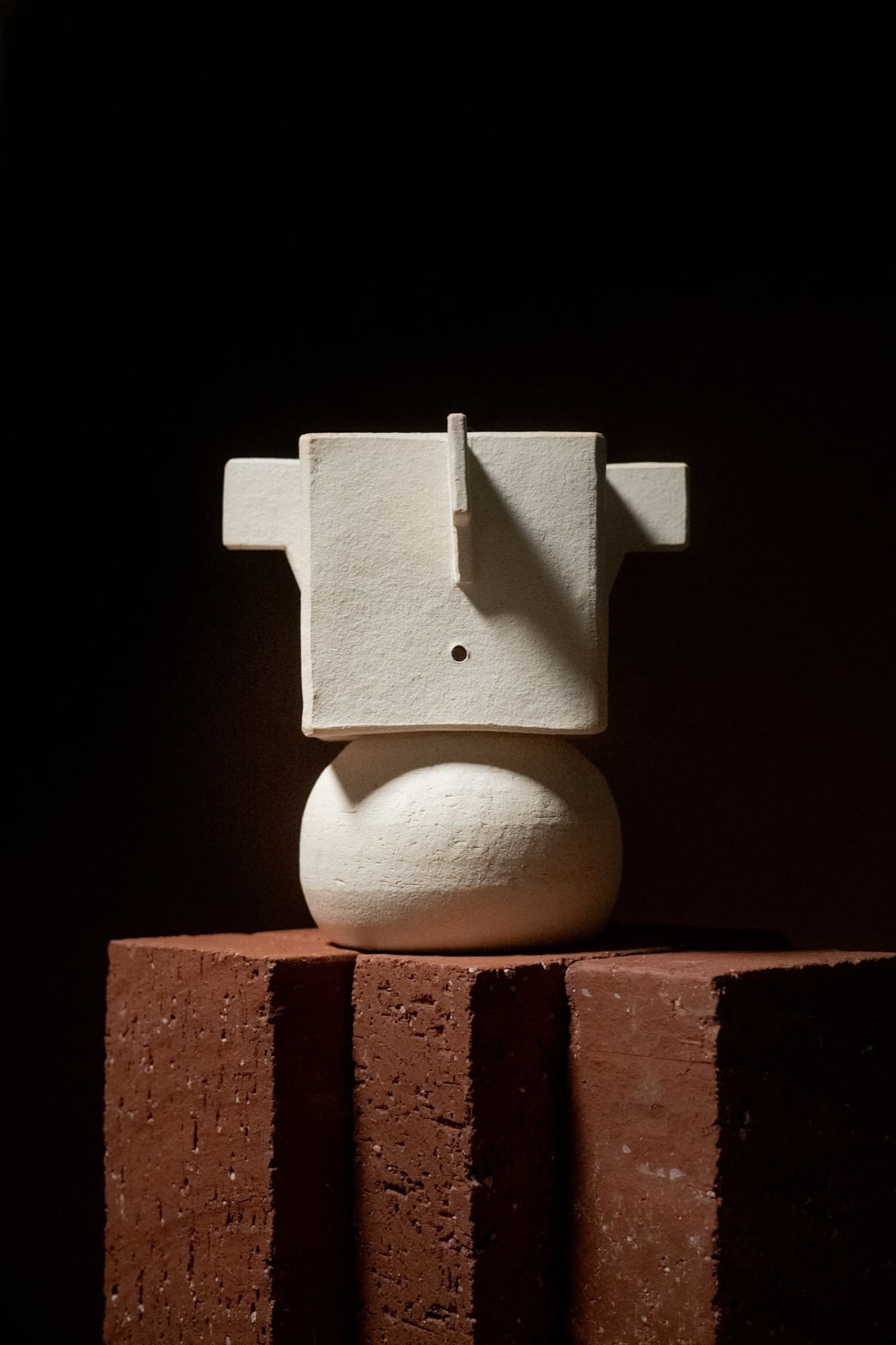
Averia Serif Libre (display) over Ancizar Serif Light (body), Albert Sans labels: restraint, whitespace, type doing the work.
Calm, contemplative, material-led. Short declarative sentences, no hype. “Each piece is photographed and written to sit with, not to scroll past.”
- Scope
- Front-end design · build
- Stack
- Next.js · Tailwind · GSAP
- Type
- Averia · Ancizar · Albert Sans
- Status
- Live